
Risk-Free Ways to Decorate with Black
Do you love the idea of black but hesitate committing to incorporate it in your home? In this blog, we’re sharing three risk-free ways to add black into your space, and illustrating how it elevates any design. We’re also dishing out our favourite black paints for those of you ready to take it to the next level and create a high-impact statement in your home.
Why Use Black?
First, let’s discuss how black will impact your space. While black may seem intimidating, it isn’t something to shy away from. It’s versatile — it can be bold, sophisticated, moody, dramatic, striking, and powerful. It can also be reined in to add a little “punch”, or used expansively to create a sensuous or powerful aura.
Black is what I refer to as the most high-impact neutral. Easily added to virtually any colour palette, it consistently provides three design fundamentals to any space. Black creates:
Depth
Drama
Dimension

In our Timber Lane Project, black accent walls and décor create a cozy ambience in the lower-level family room.
The Three D’s
Depth
I once had an art teacher suggest that every rendering needs just a hint of black at least somewhere. At the time, I was hesitant to add black and only used shades of grey to create depth. At first, I thought my art teacher was making a generalization, but when I actually put her method to the test, this simple shift took my renderings to the next level.
I realized then that black can be thought of as the baseline; it sets the tone for everything else. Because black is polarized (as in it’s as dark as you can go on the scale), it gives context to the rest of the palette, adding unparalleled depth. I’d liken black to salt: add it to any colour scheme to give the entire palette context.
Drama
If you’ve ever felt like your space doesn’t quite have the “wow” factor you desire, add some black to introduce an element of surprise and easily create a statement. Black is striking and demands the eye’s attention, making everything else around it pop.
Dimension
I’m sure you remember when you first learned that black absorbs heat more readily than white. That’s because black absorbs the wavelengths of light, as opposed to white which reflects them. Since black absorbs light, it softens any lighting scheme and creates a cozy, sultry atmosphere.
Equally important, because black grabs the eye, we can use it to create a focal point in any room. Its visual weight is the perfect way to anchor an element within a space and ground the room.

The primary bedroom of project Timber Lane demands attention with its striking spiral chandelier, and pops of black in the artwork, table lamp, and lumbar pillow.
3 Ways to Test the Waters
Now that we’ve explored how black impacts an environment, here are three subtle, risk-free ways you can incorporate it into your space:
Accent Pillows
For those who are the most hesitant to try out black, I’d suggest to start by adding a few black accent pillows. Cost-effective and easily implemented, toss cushions are a great way to make a bed or sofa pop.


Light Fixtures
Black light fixtures are a surefire way to add drama to your space and can complement virtually any colour palette.


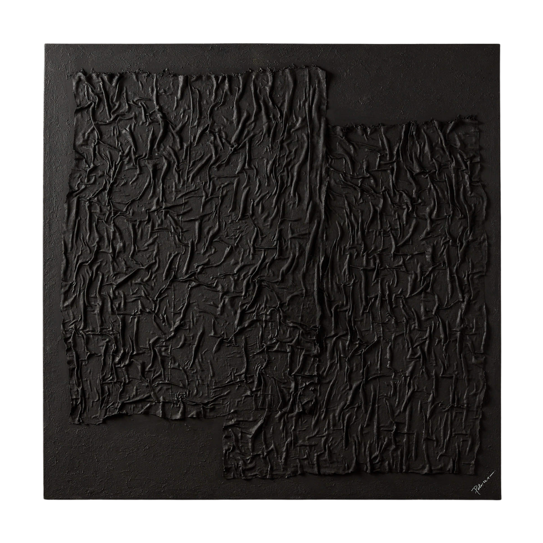
Artwork
Easily capture the eye’s attention and create a focal point by incorporating black artwork. Try hanging a piece over a sideboard in the dining area, or over a console table in an entrance.


My Go-To Black Paints
Black paint is a fantastic way to elevate virtually any home, and it doesn’t have to be as intimidating as it may sound. For a more subtle impact, try painting only decorative wall panelling like wainscoting black. Another fool-proof option is to use black paint on a vanity or feature furniture piece. Remember, black packs a punch! A little goes a long way — you don’t have to paint an entire room in order to transform your space.


With indigo undertones, Black Jack (2133-20) is a dynamic, punchy black. We used this colour for the kitchen island cabinet paint in project Cranberry Trail.
Iron Mountain (2134-30) is my top pick when painting an expansive area black. It’s soft, while still offering gorgeous depth. This was our selected paint colour for the wine cellar and accent walls in our Timber Lane project.
If you’re looking for a jet-black option that isn’t stark, Black Beauty (2128-10) is your best bet. It features a subtle warmth that reads as a rich, pitch black.

A wall-to-wall black velvet headboard instantly creates drama and luxuriousness in project Cranberry Trail. We finished the look with black and brass nightstands and wall sconces, along with black abstract artwork.
Bonus Tips!
Upholstered furniture: beware that black shows dust and pet hair more readily. I typically avoid selecting black for upholstery, except when it’s on a vertical surface like a headboard. Have a hand vacuum and lint roller handy to keep it looking crisp and tidy.
Bedding: for the same reason as above, veer away from selecting black bedding. Instead, opt for black accent throws, pillows or coverlets.
Mix black with natural materials like wood to bring warmth to the space, and to minimize the chance of black appearing stark.
Renovating? Try subtlety introducing black with door hardware and hinges, cabinetry hardware, or faucets.
Black rooms: if you’re taking a deep dive and painting parts of a room or even an entire room black, be sure to plan for ample lighting. Remember, since black absorbs light, you may find you require additional lumens to achieve adequate light levels.
I hope these tips help you begin to explore ways to work with one of the most powerful design elements - the colour black. Enjoy experimenting with the dark side!